Product Risk Scoring
Every product in your catalog receives a risk score from 0 to 100. The score is not a return rate — it is a composite signal that combines return frequency, complaint clarity, trend direction, and fix potential. A product with a 25% return rate and no actionable signal scores lower than a product with a 15% rate and 30 consistent return notes all describing the same problem. The higher-scoring product has a clear, fixable issue that the AI can act on.
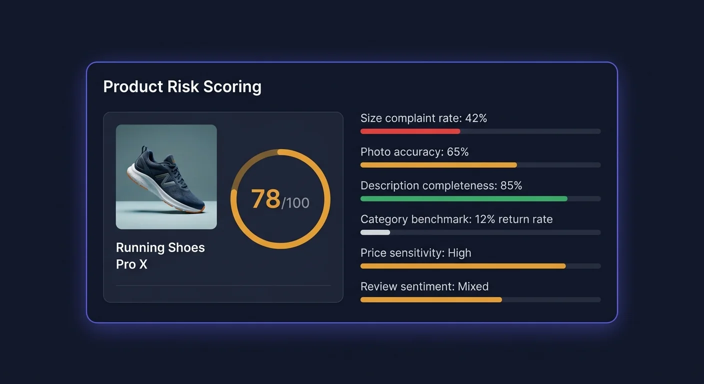
The 0–100 Score Explained
Risk scores are divided into three tiers:
| Range | Label | Color | What it means | |---|---|---|---| | 70–100 | High risk | Red | Significant return rate problem, usually with identifiable root cause | | 40–69 | Medium risk | Amber | Return rate above category average; worth monitoring and investigating | | 0–39 | Low risk | Green | Return rate at or below category average; no significant issue detected |
The score updates daily as new return data flows in. A product's score can move between tiers within a week if a sudden batch of returns arrives or if an applied fix starts reducing the return rate.
Signals That Feed Into the Score
The risk score is computed from more than 30 individual signals across five categories. Each signal contributes a weighted component to the final score.
1. Return Rate Signals (40% of score)
| Signal | Weight | Description | |---|---|---| | Raw return rate | High | Percentage of units sold that were returned in the last 90 days | | Return rate vs. category benchmark | High | How much above or below the category average the return rate is | | Return rate trend (30d vs. prior 30d) | Medium | Is the rate improving, stable, or worsening? | | Seasonal adjustment | Medium | Controls for known seasonal patterns (post-holiday spikes) | | Return rate at size/variant level | Medium | Identifies whether the problem is product-wide or concentrated in specific variants | | Recency-weighted return rate | Low | Returns in the last 30 days weighted more heavily than older returns |
Why relative rate matters more than absolute rate: A 15% return rate in the women's apparel category is well within the industry norm. The same rate in the home goods category is alarming. Scoring relative to category benchmarks ensures the score reflects genuine outliers rather than category-typical behavior.
2. Return Note Quality (25% of score)
| Signal | Weight | Description | |---|---|---| | Return note completeness | High | What percentage of returns included a written reason? | | Complaint consistency | High | Do multiple customers use similar language to describe the same issue? | | Specificity of complaints | Medium | "Runs small in shoulders" scores higher than "didn't fit" — more actionable | | Language sentiment intensity | Medium | Strong negative sentiment ("completely wrong color") vs. mild ("slightly different shade") | | Note volume | Medium | More return notes provide more reliable signal than few notes | | Repeat phrases across returns | High | Exact or near-exact phrase recurrence is a strong signal that the listing is misleading |
High complaint consistency is the most predictive single signal. When 20 out of 30 return notes say essentially the same thing, the listing has a fixable problem. When every return note is unique, the issue is likely not the listing.
3. Fix Potential (15% of score)
| Signal | Weight | Description | |---|---|---| | AI confidence in available fix | High | Does the AI have a high-confidence fix queued for this product? | | Fix category (sizing, description, photo, specs) | Medium | Sizing fixes historically have higher success rates than "color different from photo" | | Previous fix history | Medium | Has a fix been applied and underperformed? Reduces score. Applied and succeeded? Reduces base rate. | | Complaint matches fixable listing element | High | Is the complaint about something in the product title/description (fixable) vs. product quality (not fixable via listing)? |
Fix potential is what separates ReturnShield's risk score from a simple return rate ranking. A product with a high return rate caused by genuine product quality issues (e.g., a defective supplier batch) scores lower on fix potential than a product with a lower rate but a clear, AI-actionable listing error. The score directs your attention toward products where action will have impact.
4. Category Benchmarks (10% of score)
| Signal | Weight | Description | |---|---|---| | Return rate vs. category peers | High | Sourced from aggregated data across ReturnShield stores in the same category | | Return reason distribution vs. category | Medium | Are your products returned for unusual reasons compared to peers? | | Variant-level benchmark (sizing, color) | Medium | Size-specific return rates compared to same-category products with size variants | | Price tier benchmark | Low | Higher-priced products within a category have different return profiles |
Category benchmarks are updated quarterly. Your products are matched to a category based on your Shopify product type and collection assignments. If a product is in the wrong Shopify product type, its category benchmark comparison may be inaccurate — correct product types in Shopify to improve benchmark accuracy.
5. Review and Customer Signals (10% of score)
| Signal | Weight | Description | |---|---|---| | Negative review sentiment correlation | Medium | Do low-star reviews mention the same issues as return notes? | | Return rate among first-time buyers vs. repeat | Low | First-time buyers returning at much higher rates suggests a discovery-vs-reality gap | | Customer risk tier distribution | Medium | Proportion of high-risk (serial returner) customers among returners for this product | | Post-purchase question volume | Low | High volume of "does this run small?" messages is a leading indicator before return rate spikes |
Reading the Risk Breakdown
Click any product in the risk table to open the detail view. The Risk Breakdown section shows which signals are driving the score.
Breakdown Display
Each signal category shows:
- Category label (e.g., "Return Rate Signals")
- Component score (the weighted contribution from that category)
- Key drivers (the 1–2 signals within the category with the largest contribution)
Example breakdown for a high-risk product:
Return Rate Signals         ╸╸╸╸╸╸╸╸╸╸╸╸╸╸╸╸  38/40 pts
  → Return rate 31% (vs. 14% category avg)
  → Trend: +6pp over last 30 days

Return Note Quality         ╸╸╸╸╸╸╸╸╸╸╸╸╸╸╸╸  22/25 pts
  → 18 of 22 notes mention sizing issues
  → High phrase consistency: "runs small"

Fix Potential               ╸╸╸╸╸╸╸╸╸╸╸╸  12/15 pts
  → High-confidence fix available
  → Sizing description update (87% confidence)

Category Benchmark          ╸╸╸╸╸╸  6/10 pts
  → 2.2x category average return rate

Review Signals              ╸╸╸╸  4/10 pts
  → 3.1-star avg (below category 3.8-star)

TOTAL                                       82/100
What High Scores in Each Category Mean
| High score in... | What it means | What to do | |---|---|---| | Return Rate Signals | Volume problem — many units being returned | Check if recent fix resolved it; look at variant breakdown | | Return Note Quality | Identifiable listing issue — customers are saying the same thing | Review the Action Queue fix for this product | | Fix Potential | AI has a ready fix | Apply or review it in the Action Queue | | Category Benchmark | Outlier vs. peers | Compare your listing to high-performing competitors in the category | | Review Signals | Perception gap | Read the actual reviews; the issue may be more fundamental than the listing |
Using Risk Scores to Prioritize Fixes
The Prioritization Matrix
Not all high-risk products deserve equal attention. Prioritize using two axes:
- X-axis: Risk score (how severe is the problem?)
- Y-axis: Units sold per month (how many returns is this generating?)
A product with a score of 85 selling 10 units per month generates fewer returns than a product with a score of 72 selling 200 units per month. Multiply risk score × monthly volume to get an approximate impact ranking.
The Action Queue's Expected Savings sort already does this calculation — sort by Expected Savings to see the highest-impact fixes first.
Products to Address Immediately
Focus on products that are simultaneously:
- Risk score 70+ (High tier)
- Trend: Worsening (risk is growing, not stable)
- Fix potential: High (AI has an actionable fix ready)
This combination means the problem is real, getting worse, and solvable. The Action Queue will show these products at the top of the Pending list when sorted by Expected Savings.
Products to Monitor, Not Act On
Leave these in the watchlist and do not spend time on active fixes:
- Risk score 40–69, trend Stable — monitor monthly
- Risk score 70+, Fix Potential: Low — the issue may be product quality, not listing quality; investigate supplier
- Risk score recently dropped below 40 after a fix was applied — the fix is working
Products to Investigate Separately
High risk score, no AI fix available, high volume of unique (non-repeating) return notes: the problem is product quality, not listing quality. Investigate the product itself — supplier batch quality, packaging, size calibration. A listing fix will not help.
Category Benchmarking
How Your Products Are Categorized
ReturnShield maps your Shopify product types to standardized categories used for benchmark comparison:
| Shopify product type | ReturnShield category | Typical benchmark range | |---|---|---| | T-Shirts, Tops, Blouses | Women's Tops | 14–20% | | Jeans, Trousers, Shorts | Women's Bottoms | 16–22% | | Dresses | Dresses | 18–26% | | Footwear, Shoes, Boots | Footwear | 20–30% | | Electronics, Gadgets | Consumer Electronics | 8–14% | | Furniture, Home Décor | Home Goods | 5–10% | | Supplements, Vitamins | Health | 3–7% | | Books, Digital | Media | 1–4% |
If your product types in Shopify are non-standard (e.g., "My Custom Category"), ReturnShield uses machine learning to classify them based on product title and description. Verify the assigned category in the product detail view — correct it by updating the Shopify product type if it is wrong.
Benchmarks Update Quarterly
Category benchmarks are recalculated at the start of each calendar quarter using aggregated, anonymized data from ReturnShield stores. You receive an in-app notification when benchmarks are updated. A product's risk score may shift at benchmark refresh time even if nothing changed in your own data — this is expected and reflects changes in the industry baseline.
Score History and Tracking Improvement
The product detail view includes a 12-month score history chart showing how the risk score has evolved over time. Key annotations on the chart:
| Annotation | Meaning | |---|---| | Gray pin | Action Queue fix applied | | Blue pin | Inventory restock (product type restocked with new units) | | Orange pin | Product description edited outside of ReturnShield | | Red pin | Return spike alert fired |
Reading Score Improvements After Fixes
After applying a fix, the score typically takes 2–4 weeks to visibly respond. The lag occurs because:
- Customers who purchased with the old listing are still receiving and potentially returning products
- The score uses a 90-day rolling window — old return data continues to influence the score for up to 90 days
A fix that was applied 30 days ago will only have reduced the window by a third. Full impact is visible at the 90-day mark. Use the 60-day outcome tracking in the Action Queue (Applied tab) for earlier performance data.
When a Score Does Not Improve After a Fix
If the score is still high 6–8 weeks after applying a fix:
- Check the Applied tab in the Action Queue — did the actual return rate decrease or stay flat?
- If rate decreased: the score will follow; the 90-day window has not fully rolled yet
- If rate did not decrease: the fix did not address the actual reason customers are returning
- Review the current return notes — has the complaint theme shifted to something new?
Next Steps
- AI Action Queue — apply the fixes that high-risk products have queued
- Dashboard — understanding risk scores in the context of overall return rate trends
- ROI Tracking — measuring the impact of applied fixes over time