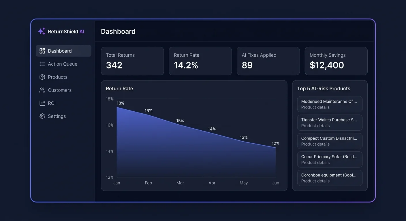
Return Intelligence Dashboard
The dashboard is your command center for understanding returns. It consolidates return rate trends, product risk scores, customer segments, and true cost data into a single view so you can see at a glance where your biggest problems and best opportunities are.
Accessing the Dashboard
After installation and initial data sync (up to 24 hours for large stores), navigate to Apps → ReturnShield AI. The dashboard is the default landing page.
The date range selector in the top-right corner controls the period shown across all metrics. Options: Last 7 days, Last 30 days, Last 90 days, Last 12 months, or a custom date range. Most stores work with the Last 30 days view for operational decisions and switch to Last 90 days for trend analysis.
Return Rate Overview (Top Row)
The top row shows three metrics side by side:
Your Current Return Rate
The percentage of orders that had at least one item returned within the selected date range. This is calculated as:
Return rate = (orders with at least one returned item) / (total orders placed) × 100
Important distinction: ReturnShield counts completed returns — orders where a refund was issued and the item was marked as returned in Shopify. It does not count pending return requests or denied returns. This means ReturnShield's figure will typically be lower than Shopify's native return reports, which include all return requests. This is intentional — it reflects your actual cost exposure.
Industry Benchmark
The average return rate for stores in your primary product category. Categories are assigned during the initial setup based on your store's product types. Benchmarks are updated quarterly using aggregated data from Shopify stores in the same category.
| Category | Typical benchmark range | |---|---| | Women's apparel | 18–25% | | Men's apparel | 12–18% | | Electronics | 8–14% | | Home goods | 5–10% | | Footwear | 20–30% | | Accessories | 5–12% |
Status indicators:
- Green dot: Your rate is below the benchmark
- Amber dot: Your rate is between 1x and 1.5x the benchmark
- Red dot: Your rate exceeds 1.5x the benchmark
A red indicator does not automatically mean your store has a fixable problem — some product categories have structurally higher return rates. Use the product risk table to identify whether the elevation is concentrated in specific products (fixable) or spread evenly (potentially structural).
Your 12-Month Baseline
Your own store's 12-month average return rate, regardless of the selected date range in the date picker. This metric always shows the full year to provide context for seasonal fluctuations.
If your current rate is above the 12-month baseline during January, that is expected — post-holiday returns are universal. If it is above baseline in July, that warrants investigation.
Return Rate Trend Chart
The line chart below the overview shows return rate over time for the selected period. This is the most diagnostic section of the dashboard.
Reading the Chart
- X-axis: Time (daily for 7-day and 30-day views; weekly for 90-day; monthly for 12-month)
- Y-axis: Return rate percentage
- Hover tooltip: Shows exact return rate, order count, and return count for that point
- Benchmark line: A dashed horizontal line showing the industry benchmark for comparison
Identifying Spikes
A spike is a visible increase in the return rate over a short period. Not all spikes are equally concerning:
| Spike pattern | Likely cause | |---|---| | Sharp spike, then immediate return to baseline | One-time event: a bad product batch, a carrier issue, or a promotional window | | Gradual rise that plateaus at a higher level | Structural issue: a product description that was never accurate, or a new supplier with different sizing | | Seasonal spike (January, post-major promotions) | Normal pattern — gifted items returned, impulse purchases regretted | | Spike on specific day of week | Order volume pattern — return rate may look elevated on days with low new orders |
Click-to-filter: Click on any spike in the chart. The product risk table below the chart immediately filters to show only products with elevated return rates during the selected spike period. This is the fastest path from "I see a spike" to "these are the products causing it."
Contextual Annotations
ReturnShield adds automatic annotations to the trend chart for key events:
- Gray pin: Action Queue fix applied (lets you see whether the return rate changed afterward)
- Blue pin: Return spike alert fired
- Orange pin: New product launch (if product creation date overlaps with return spike)
True Cost Calculator
![]()
Most store operators track return cost as refund value. The True Cost Calculator adds the hidden components that make the real figure 2–3x higher.
Cost Components
| Component | What it includes | Typical range | |---|---|---| | Refund value | The actual refunded order amount | Varies | | Outbound shipping | Cost of the original shipment to the customer | $5–$15 | | Return shipping | Cost of the return label (if you provide prepaid labels) | $5–$20 | | Processing cost | Warehouse staff time to receive, inspect, and restock | $3–$15 | | Restocking loss | Items that cannot be resold at full price (damaged packaging, worn, etc.) | 15–40% of item value | | Total true cost per return | Sum of all above components | Typically 1.8–3.5x refund value |
Worked Example
Suppose your average returned order value is $65 and your store processes 200 returns per month:
| Component | Unit cost | Monthly total | |---|---|---| | Refund value | $65.00 | $13,000 | | Outbound shipping (already paid) | $9.00 | $1,800 | | Return shipping (prepaid label) | $8.50 | $1,700 | | Processing cost | $7.00 | $1,400 | | Restocking loss (25% of items × $65 × 30%) | $4.87 | $975 | | Total true cost | $94.37 | $18,875 |
The refund amount alone ($13,000) would suggest a manageable problem. The true cost ($18,875) — 45% higher — makes the business case for return reduction much more compelling.
Editing Cost Assumptions
The calculator uses industry-average estimates by default. To enter your actual costs:
- Go to Settings → Cost Assumptions
- Enter your warehouse processing cost per return, return shipping cost, and restocking loss rate
- Click Save — the dashboard immediately recalculates with your figures
Accurate inputs make the calculator a genuine business tool rather than an estimate. Present the true cost figure to your leadership team to justify investment in return reduction.
Product Risk Scores Table
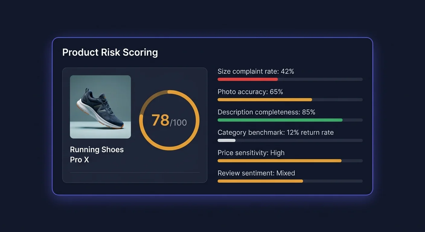
Every product in your catalog ranked by risk score. The table shows:
| Column | Description | |---|---| | Product | Name and primary variant image thumbnail | | Risk score | 0–100. Above 70 = high risk (red). 40–69 = medium (amber). Under 40 = low (green) | | Return rate | Returns as a percentage of units sold, over the selected period | | vs. category avg | How the product's return rate compares to similar products in your catalog | | Top return reason | The most common complaint theme identified from return notes | | Pending fixes | Number of Action Queue items waiting for review for this product |
What the Risk Score Means
The risk score is not simply the return rate — it factors in:
- Return rate vs. category benchmark (relative performance, not absolute)
- Trend direction (is the rate rising or falling?)
- Return note quality (products with clear, specific complaints score higher because they have fixable problems)
- Fix potential (products where the AI has high-confidence fixes available score higher, because the problem is identified and addressable)
A product with a 25% return rate and zero clear complaints scores lower than a product with a 15% return rate and 30 return notes all saying the same thing — the latter has a clear, fixable issue.
Clicking a Product
Click any row to open the Product Detail view:
- Full breakdown of return reasons (pie chart + list with percentages)
- Individual return note excerpts from the last 90 days
- Return rate trend chart for this specific product
- All pending, applied, and rejected Action Queue items for this product
- Size-level return rate breakdown (for apparel products with size variants)
Customer Segment Summary
The segment panel shows the count of customers in each of the four tiers with their aggregate return rates:
| Tile | Shows | |---|---| | Champions | Count + average return rate | | Standard | Count + average return rate | | At Risk | Count + average return rate | | Serial Returners | Count + average return rate |
Click any tile to navigate to the Customer Segments detail page for that tier.
Savings to Date
The bottom-right card shows cumulative estimated savings from all applied AI fixes since installation. The calculation:
For each applied fix:
  (pre-fix return rate - actual post-fix return rate)
  × units sold per month
  × true cost per return
  × months since application
This number compounds over time as more fixes are applied and their impact accumulates. For most stores, the savings-to-date figure exceeds subscription cost within the first 60–90 days on the Starter or Growth plan.
Filtering the Product Risk Table
Use the filter bar above the product risk table to narrow your view:
| Filter | Options | |---|---| | Risk level | All, High (70+), Medium (40–69), Low (0–39) | | Category | Filter to a specific Shopify product type | | Return reason | Sizing, Not as described, Quality, Changed mind, No reason | | Has pending fixes | Show only products with action queue items | | Return rate | Above a percentage threshold | | Trend | Improving, Stable, Worsening (based on last 30 days vs. prior 30 days) |
The Worsening trend filter is particularly useful for proactive monitoring — it surfaces products where the return rate is rising before they generate enough volume to hit the High risk category.
Exporting Data
Click "Export" in the top-right of any table or section:
| Export | Format | Contents | |---|---|---| | Product risk table | CSV | All columns visible in the current filtered view, plus raw return count and order count | | Customer segments | CSV | Customers in the selected segment with risk scores and LTV | | Savings to date | CSV | Fix-by-fix breakdown of predicted and actual savings | | Return reasons | CSV | Aggregated return reason data by product and category |
Exports reflect the current filter state — apply filters before exporting if you want a subset. All exports are generated immediately and downloaded to your browser.
Next Steps
- AI Action Queue — review and apply the fixes ReturnShield has generated
- Customer Segments — understand the four risk tiers and what to do with each
- Shopify Flow — automate actions when risk events occur